If Seeing is Believing, then Let’s See the New Graphical Analytics in the Telemetry Dashboard Released by SIERA.AI
Forklift telematics and analytics is about storing raw data and presenting the captured data in various ways that the end user can apply in order to make decisions. This is what safety professionals need in order maintain safety within their facility. In order to capture that data, a forklift safety system is installed on the forklift and as it moves throughout the facility, the forklift safety system begins to collect data that it ‘sees’. It then takes the data and uploads it into the forklift telematics and analytics online, in real-time. What is it that you want to know? Are you interested in understanding impacts? How many and the severity of the impacts? What about near misses? Do you want to know how many potential impacts there might have been… but didn’t happen? Would this possibly mean that you could prevent an area from maturing into a more dangerous area? Let’s explore some of the graphic analytics that SIERA.AI has developed to enhance its current telemetry Dashboard offerings.
What is Forklift Telematics and Analytics?
Forklift telematics and analytics is the ability to store data and intelligently coordinate the data into a way that can be visually presented for a clear and accurate way to understand the results for the purpose of making a more informed, applicable decision.
There are three categories that our safety professional customers want to know more about so those answers can be applied to their safety decisions. These areas are: Inspections, Impacts and Near Misses.
The Library
In the telemetry Dashboard, there is a section dedicated to Analytics. Within the Analytics section is a Library, where you’ll find two columns. The column on the left is your ‘Chart Library.’ It provides a list of charts for the three categories of inspections, impacts and near misses. A plus + sign is next to each section that when you click on it, expands into deeper ways you can graphically view the data you are interested in learning more about.
The column on the right is empty. This is your custom space for you to choose which reports you want to view. You can add or delete items in your list at any time. Choose the chart from the left column and place it in the right column. The chart will automatically populate with the data stored in the telemetry Dashboard. Click on it, to view the data. Change the chart as often as you want in order to view the data in new ways.

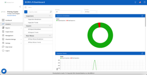
Sample Inspection Breakdown Chart
Take a look at the example provided for you. Once you’ve made your selection of which graphical analytics you want to view, you’ll see your list on the left side. When you click on one of them, this one is on Inspection Breakdowns, you’ll graphically ‘see’ what the breakdowns are graphically depicted in a couple of different ways. Which ever one works better for you is fine by us.
However, we do want to point out the top bar. You can view your data by all of your facilities or ‘sites’ or view it by the individual sites. In addition, customize the date range. Do you want to view it for ‘all time’ or do you want to view your data by a smaller date range. However, you want to view it, the SIERA.AI telemetry Dashboard can help.
Contact Us!
Contact us today at sales@siera.ai or call us at (512) 817 0702.
