New Graphics-based Charts to Depict Minimum – Means – Maximum in Forklift Data Analytics
If you are a company that adheres to the highest safety standards, you know that there is always something more than can be done a little bit better. But where? As a safety professional, you may have many self monitoring processes in place to help you identify areas of risk. One of the most challenging areas to monitor and improve risk is with the forklift fleet. We’ll be discussing forklift data analytics as the solution for reducing risk in the facility. Let’s get started.
AI on Forklifts is Not New…Anymore
SIERA.AI alone has been providing AI safety on the forklift for 7+ years. Those are early adaptors have already purchased their forklift safety system and have made improvements. Customers of SIERA.AI are more specific about the data to collect as full blown telemetry systems can be too much, to the point of hiring a full-time employee in order to operate the software. Not what the facility manager wants to do…take on another headcount just for software. Our customers have been more specific and we’ve heard their requests.
Telemetry Dashboard
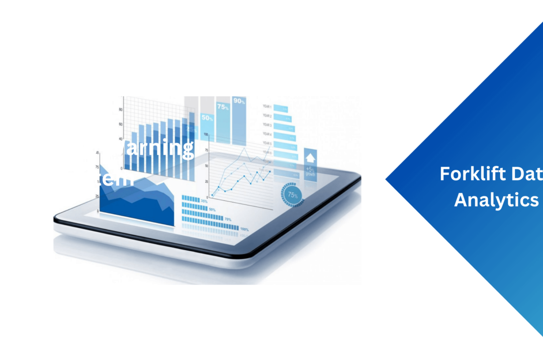
SIERA.AI’s telemetry Dashboard is a graphics-based, easy to navigate telemetry solution. We’ve designed it so our customers can get at the answers to the data quickly in order to make decisions and move on. What we’ve developed next for the forklift data analytics are 6 brand new analytic charts that provides a new and different perspective on how to interpret the forklift data analytics reports: Minimum – Means – Maximum. Let’s take closer look at these charts.
Six Brand New Charts Added to the Library
Each of the six new charts focus on the Minimum – Means – Maximum values. Each of the reports can be defined in different ways to give you the forklift data analytics that you are looking for. Quickly get to the information you need by viewing the data by worksite. View the data by a single worksite, or all of the worksites in total. Up to you how you want to be able to analyze the information. Next, choose the duration or time. You can pinpoint specific time periods all the way to ‘all-time’, meaning since you started capturing the data.
The charts are interactive. Use your curser to view further information such as date, distance and if this a maximum, means or minimum data point. The charts are easy to read and allows you to get to the information you need very quickly without generating specific reports and hoping it’ll work.


Summary
By viewing the charts, you get an overall understanding if the processes you put in place are effective and if your risk is being reduced, staying the same or even increasing. For example, let’s take near miss distance across time. It’s great to know if you are having near misses. To know what is the distance is can be quite revealing. What would it mean to you if the distance was 4 feet away versus 1 foot away? In order to reduce this risk, your plan and message could be different with 4 feet vs 1 foot, especially if it’s your mean.
Contact Us!
Contact us today at sales@siera.ai or call us at (512) 817 0702.